Now Showing: Milwaukee Film
Helping a cornerstone of the Milwaukee arts non-profit scene reinvent itself becomes a collision of tastes in an adopted city and a belief in going bold when rooting for what you love. This is about movies, Milwaukee, and what happens when a wish for the right project turns into the responsibility to get it right.
Fade In
As a kid in high school English class I remember showing the dinner scene of David Lynch's Eraserhead to the confused, grossed-out faces of my classmates and knowing with certainty that this—both my love of movies and my realization that my tastes were different from anyone else's—would be a consistent experience in my life. At art school I studied film, which led me to animation, and then illustration and design. And while I still use storytelling techniques in my digital work and UX, my career definitely veered differently than I anticipated.
For one thing it eventually took me to a new city. And a new love was born.
That city was Milwaukee. A city that's generous and forgiving, allowing one to grow and thrive with lower pressure and fewer complications. It supports its own and roots for its people. People who are down-to-earth and accepting, even to a weirdo like me. In Milwaukee a little ambition can go a long way. It allowed me to co-create a business where I help tell the stories of local brands using those tools and tastes I'd developed from high school to art school to here.
So when Milwaukee Film sent an RFP to build a new website, I wanted Northern Ground to get the gig maybe more than any project in our company's run.
Milwaukee carries on at the margins of the national story, uncomplaining, showing up for work every day without fanfare. Independent cinemas are quietly doing their best to endure in a landscape reshaped by chains, streaming and video games. Both are old-fashioned. Both are underdogs. Both I love.

Inciting Incident
It may have began as a website RFP but through our talks we quickly realized that what Milwaukee Film needed wasn't just a website, but a rebrand, and one that for practical reasons had to be completed before any web work could begin. This slowed the timeline while raising the stakes. A comms-and-commerce effort became a deeper exercise in defining an important organization's identity, managing its existing reputation, and clarifying its mission.
Suddenly, the project felt personal. We had a chance to help the future of a cherished organization and a beloved city, or to get it wrong in a way that could undermine both.
The organization wasn't completely changing, just turning a corner. With Milwaukee Film's equity having been built over 18 years, we didn't want to completely wipe the current branding but make it something that unites all its iterations and be more useful day-to-day.
The prior Milwaukee Film logo.
Flashback
The previous brand was designed [by a different firm] in 2010 during a retro, midcentury revival that was a direct response to the fact that we were experiencing brands primarily in the digital space for the first time. The faux-heritage grit helped organizations feel authentic. And for a blue collar city that wears its history on its sleeve, the mark worked and looked good.
But it was also a center-aligned, symmetrical decal that made it challenging to lock up in the myriad of collateral—posters, theater slides, digital banners, T-shirts, billboards, etc—that decorated the customer journey of a moviegoer. And when the brand is relegated to the corner of a poster dominated by the million-dollar smile of Hugh Jackman; it's no wonder. It's the last thing you see.
Also, few people actually know what Milwaukee Film even is. They know the theaters, the Oriental and Downer. They know their annual festivals, like the Milwaukee Film Festival and the Dialogues Documentary Film Festival. Or they might know one of their many programs, like Black Lens or Cinema Hooligante. But most folks don't associate all of that with the non-profit that is responsible for them.
The preservation of the two historic movie palaces is a critical part of Milwaukee Film's mission, but we needed to focus on the experience of movies in a way that was inclusive of all the work the org does, rather than specific venues (however gorgeous). The research for the Oriental Theatre specifically was inspirational and simultaneously problematic.
One inspiration from this research became an important part of the web design, but more on that in a sec.
Ope! The new Milwaukee Film logo.
The Turning Point
While it may look different, the redesign is a direct evolution, rather than a replacement. The prior logo focused on the light emanating from a theater projector, and this never felt quite right. Why are you looking at the projector itself and not where it's projecting? Turning that around felt like a breakthrough. Rather than the mark focusing on the organization, we wanted it to focus on you, the audience being served by that organization.
The new logo is from the POV of a seat in the theater, looking up in awe.
We realized it's technically not cinema we're talking about. I mean of course it is but our devices are an infinite playlist of movies just a tap away. What we're celebrating is a community of people who love cinema and stories, driven by curiosity, nostalgia, and discovery, rather than passive consumption and algorithmic convenience (AI reels of hybrid dog-humans dancing to a Kendrick deadmau5 mashup). We celebrate messy human curation. We celebrate coming together with other people for a shared experience—watching movies the way they were meant to be seen! On the BIG screen.
In fact, the new brand is quite literally a call-to-action to enlarge your screen. Enlarge your view. Look up! This big screen is a timeline of aspect ratios showing the complete history of film. It's a portal to experiencing the past and cherished memories one day, and entirely new worlds and ideas the next. It is the place beneath which Milwaukee gathers to laugh and scream and think. Our hope is that it is Milwaukee. It's eating a Friday Fish Fry while walking through the Streets of Old Milwaukee and bumping into Milverine as he hums Blister in the Sun. Well, we can dream.
The recursive frames celebrate the history of film formats.
The nested nature of all the components mean endless variation that retains consistency.
Outside Milwaukee no one understands 'MKE.' The new brand system prefers a monogram that makes more sense.
Color when it needs to be bold. Streamlined when it needs to be elegant, perhaps as festival laurels.
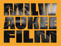
Pushing the letters to the edge of the shape means any element can frame film imagery and remain readable.
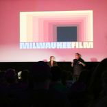
Your proud author debuting the new brand to a packed house at the Oriental Theatre.
Expository Montage
But if it's not practical, who cares? The nested shapes of the big screen become frames to use in lockups and promotions, allowing the new branding to be present while still giving the films themselves center stage. We like to think this is the most flexible brand system we've ever conceived, with over 50 different canonical variations to fit every need. All of which communicating that this is Milwaukee Film, the non-profit organization at the heart of the theaters, the festivals and the programs.
The color system is also meant to be flexible and infinitely usable. Inspired by the theaters, selected for maximum boldness, and bounded by ADA contrast standards, the spectrum system as a whole shows movement and diversity, but individually every color has a counterpart of suitable contrast. While the red-yellow set has been chosen for the initial brand debut, new color sets are also being conceived for new seasons and initiatives, because the specific colors themselves aren't the brand, the boldness and spectrum is: a spectrum of voices, eras, and perspectives side-by-side.
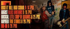
Sample web banner showing the utility of the color system.
Cliffhanger
The wordmark is also an evolution of its past iteration. Both industrial and woodsy (just like Wisconsin) the solid, machine-age block caps have been pushed as bold as possible to fill out the new frames that house them. Bold enough for themselves to be used as frames for cinematic images.
The new brand system was shown to leadership of Milwaukee Film and received an overwhelmingly positive response. Steve Laughlin, founder of Laughlin Constable, who sits on the Board of Milwaukee Film, called it "world class" and that response was echoed by the full Board and other members.
Change is always risky, and people build relationships with the totems of things they love in ways that have nothing to do with practicality or shifting communication strategies. But we hope Milwaukee will love the new brand as much as we loved making it, despite how different it is.
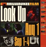
A homepage that shouts, "NOW PLAYING - STEP RIGHT UP!'
The Final Act
With the branding completed, the web work could begin. It would take a second article as long or longer to explain the discovery process we went through, the objectives and ambitions of the new site structure and content, and all the very deliberate decisions we made during UX, design and build. Site audits, member surveys, gut instincts, all while still pushing to be bold and memorable in a world of forgettable movie sites and ticket aggregators.
The first goal was to make it easy to know what films are playing, and to bring those films to life. The second was to encourage membership and support and all of the passionate people and companies of Milwaukee who nurture and advocate for it. The third was to clarify what Milwaukee Film is, what it stands for and how it is working hard every day to pursue those efforts. Milwaukee is better place because Milwaukee Film exists. It's an under-appreciated thread in the fabric of our quirky little town.
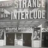
Miller Brewing Theater Complex on Fifth and Wisconsin Avenue, built in 1915.
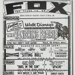
Milwaukee Journal ad for Fox Theaters—the dominant theatrical enterprise in Wisconsin until the early 50's.
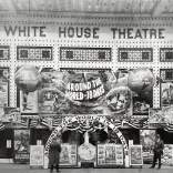
The marquee for The White House, located on the west side of North Third Street opened in 1917.
An insight from our research became a cornerstone of the new site design - huge typographic signs that used to be plastered all over the facades of the theaters. Milwaukee Film is, after all, in the business of exhibition. We want the site to bark and ballyhoo to a passersby to step in out of the cold, take a load off, and experience worlds of wonder and imagination on the best screen (with the best popcorn) in town.
Susan KernsWorking with Northern Ground has been a game changer. They didn’t just elevate our brand, they brought to life our mission in ways we hadn’t imagined possible. I loved hearing about how their research process informed their design as well as how they brought the film form itself into our visual and digital identities. We couldn’t be happier!
Credits Roll
The site just launched and is only getting started.
We're updating it weekly based on visitor input and staff feedback. The new Eventive ticketing system is running well. People are discovering films they wouldn't have before, and we're excited to see the creative staff at Milwaukee Film fill the site up and bring it to life. Designing the 2026 Milwaukee Film Fesitval identity is next for us.
The early reviews are mixed, as you'd expect for something new and different. But just as I found myself all those years ago standing in front of class of confused students watching David Lynch, I realized this project was so important to me because it's a chance to celebrate the weird, the risky, and the unexpected; the impulses that drew me to movies in the first place, the things I love about design today.